Performing Arts
Digital Exploration: Magnificent Set and Costume Designs To View at Home
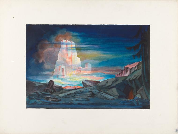
Among the truly unique materials in The New York Public Library for the Performing Arts are original set and costume designs. Many thousands of designs are held collectively by the Billy Rose Theatre Division, the Jerome Robbins Dance Division and the Music & Recorded Sound Division. Assembled from many different sources, it is an incomparable resource for exploring and understanding the technique, process and art of set and costume design.
The Music & Recorded Sound Division is particularly fortunate in that its collection of nearly 4,000 designs has been digitized. Thanks to the efforts and cooperation of heirs (as well as those items in the public domain) we are able to allow viewing of over 1,200 images through our Digital Collections portal. (As we clear rights, we will be able to add more.)
For those casually interested in set design, this collection provides a fascinating selection of visual stimulation and an opportunity to closely examine the artistry, creativity, and craftsmanship of designing and constructing sets and costumes. Even without performers it’s possible to see how the sets and costumes go far to create not just a physical space but an atmosphere that serves the characters and narrative of the opera.
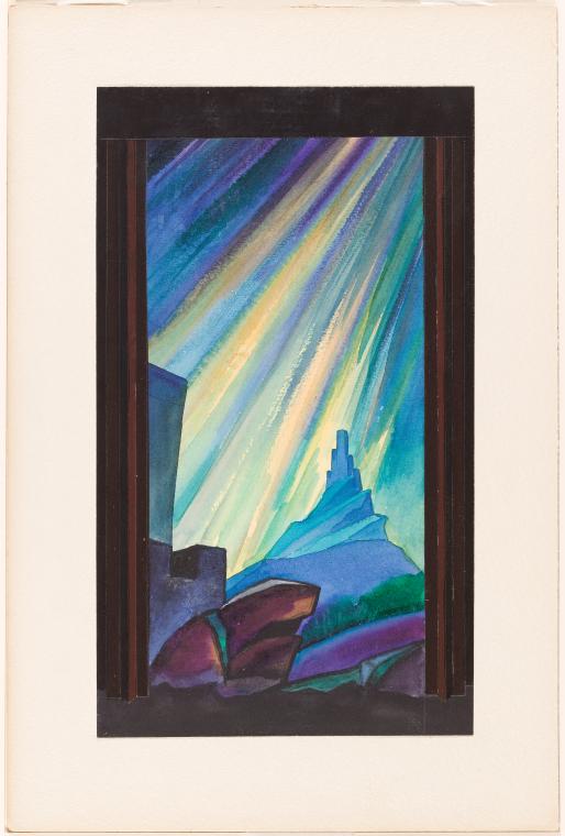
For those who wish to delve deeper into the world of set and costume design, the works that we have online provide amazing lessons in this often underrepresented aspect of opera production.
I sometimes ask myself what characterizes the difference between set and costume designs created for plays as opposed to opera. In a play, the script along with its stage descriptions and directions serve as the basis for its sets and costumes.
Opera also has its text: the libretto with its accompanying stage descriptions and directions. But in opera the main difference is the music. Music is the main focus in opera because it carries information about the narrative or setting that is not present in either the libretto or stage directions. In writing about his production of Wagner’s Die Walküre, designer Richard Rychtarik (1894-1982) wrote, “The directions for [the] scenic picture [need to come] directly from the music instead from the scenic directions dictated by Wagner.” To me, the most talented and successful stage directors and set designers deeply understand that, whatever the setting, in opera, it is the music that can have the largest impact on the performance because it supplies information or emotional context that is not present in the words.

In his recently published book, Opera as Opera: The State of the Art, singing teacher and long-time opera critic Conrad L. Osborne drives home the concept that, while we may study the different components that comprise an opera, a true “opera” is only actualized in its performance with an audience witnessing a theatrical event. Recordings, whether they be only audio, the latest enhanced DVDs, or streaming, are mere surrogates that restrict experience and perception. To be sure, unless we were present when these designs were actively used, we can never experience exactly how they functioned in conjunction with numerous other elements in a performance.
Nevertheless, the existence of these materials—and now the ability to see them—allows us to exercise our powers of imagination at trying to reconstruct what designers (and the directors with whom they worked) were trying to achieve in their productions. All set designers have the challenge of creating a setting that, while it may represent or symbolize a historical or mythical time and place, must also speak to contemporary audiences. In understanding what they were trying to do, we should not fall into the trap of looking at these works as if they were created today. Even the casual user should try to understand the historical and cultural context in which these unique works were created.
The majority of works in this first release are from the papers of Richard Rychtarik. His Wikipedia article provides a general overview of his activities, starting out as a Czech designer, emigrating to the United States in the 1920s, creating works for the Cleveland Orchestra and other organizations, both opera and theatrical works. His major stage achievement was working with the Metropolitan Opera from 1941 through 1949. Subsequently he became a staff member of CBS's television department. Despite his extensive experience in opera and theater, he is probably most known for creating the sets for Jackie Gleason's sitcom The Honeymooners.

Some years ago, Barbora Příhodová, a professor at Villanova University, was awarded one of the New York Public Library’s Short-Term Research Fellowships. This enabled her to spend time with Rychtarik’s papers (part of a larger project devoted to Czech designers of performance spaces). After visiting other locations that have archival materials related to Rychtarik, she wrote a fascinating article where she tried to understand how the designer’s influences resulted in his creations. I highly recommend reading this article in Theatre and Performance Design (which is freely available) while observing and studying his designs.
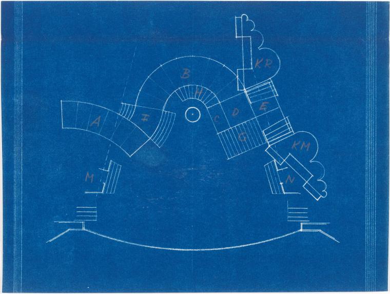
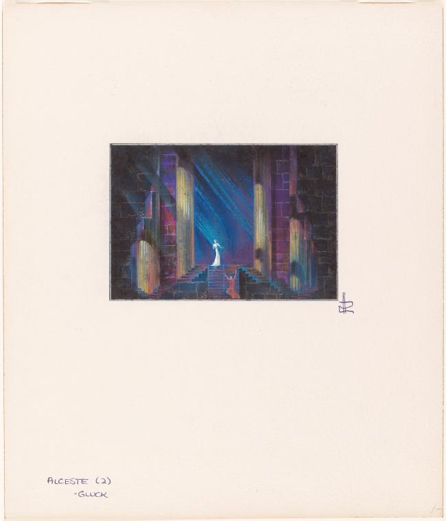
Rychtarik made his Met debut with the company's first production of Gluck's Alceste, January 24, 1941. As described in Příhodová's article, both Rychtarik and director Herbert Graf had to manage with a lack of financial resources. They conceived their Alceste as inspired by Euripides, stylized so as to bring out human elements. As with most of Rychtarik's work, his sketches for Alceste contains not only the designs but the blueprints for how to execute construction of the set.
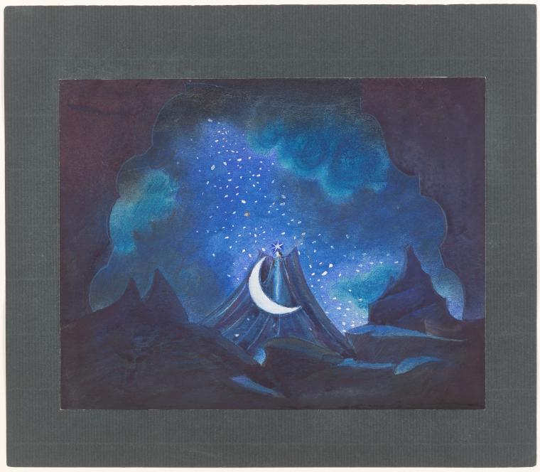
I find nearly all of Rychtarik’s work mesmerizing due to his inventive use of colors and shape. His designs for the 1941 Met production of Mozart’s The Magic Flute (the opera was done in English) are special. This production observed the 150th anniversary of Mozart’s death and was led by conductor Bruno Walter. (The Music & Recorded Sound Division is proud to have the papers of Bruno Walter.)
Virgil Thomson, a tough but fair critic, wrote of this premiere of this production:
The evening as a whole was one of the most delightful I have spent at the Thirty-Ninth Street emporium of music in many years. The first cause of this pleasure was Bruno Walter. He paced the work so rightly, speeded it so justly, and balanced its sonorities so clearly that one was unaware that there was any conductor at all. The whole thing sprang as music full born and rounded. Rarely have I heard an opera so unmaimed. The second reason was the scenery and costumes of Mr. Richard Rychtarik. Though not strikingly original or powerful in themselves, they were dignified, fanciful, tasty. The stage direction was pleasing too, and the scene shifting, so often a dragger-out of this work, was as expeditious as anyone might wish.
Anyone can now view Rychtarik’s sketches and designs for this production from nearly 80 years ago.
The things which I find immediately striking are the colors and shapes. The darker elements of the opera are obviously expressed with darker colors, heavily leaning on shades of blue, while the scenes dealing with Enlightenment lean heavily on shades of red. Note also the contrast between the geometric shapes of columns and the free-style dynamism of other scenes, or when the two styles are combined. It is truly a feast for the eyes.
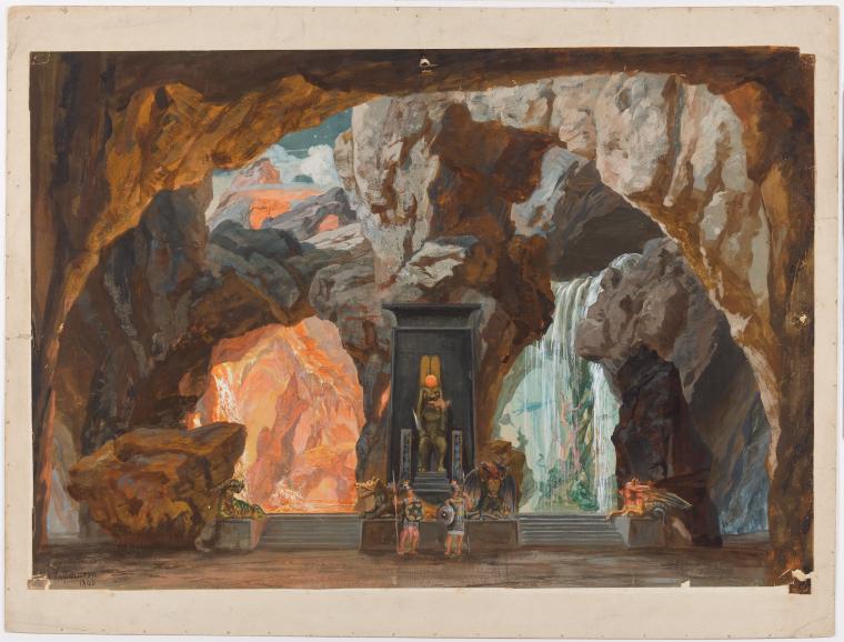
Rychtarik also collected scene designs from others artists. One of those is Josef Hoffmann (1831-1904) whose designs for an 1865 production of Die Zauberflöte are included with those of Rychtarik.
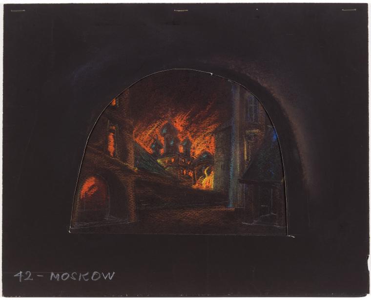
Sometimes it’s truly fascinating to explore unrealized projects. In 1946, the Metropolitan Opera was planning what would have been the American premiere of Sergey Prokofiev’s 1945 opera War and Peace (Voina i mir). Although it never came to fruition, enough preparatory work was done that Rychtarik began to design the scenery.
I can’t help but be struck by the very atmospheric designs and use of colors. Clearly Rychtarik was thinking of dark blues and greens for portions of the opera (perhaps equating it with the “peace” section) and shades of red for the war or those portions with extreme emotional content. It’s interesting to see the contrast between the geometric designs (for example, for the ballrooms) and the more expressionistic settings that depict scenes of great emotional content.
Again we are most grateful to the Rychtarik heirs for allowing us to open up his fascinating work to the world for purposes of education and study. As we secure more rights to our Set and Costume Design Collection, we hope to present most if not all of our collection online. In so doing, we hope to provide knowledge about the unique craft and art of stage and costume design.

Read E-Books with SimplyE
 With your library card, it's easier than ever to choose from more than 300,000 e-books on SimplyE, The New York Public Library's free e-reader app. Gain access to digital resources for all ages, including e-books, audiobooks, databases, and more.
If you don’t have an NYPL library card, New York State residents can apply for a digital card online or through SimplyE (available on the App Store or Google Play).
Need more help? Read our guide to using SimplyE.
Comments
Kosovky opera
Submitted by Terence Ford (not verified) on June 2, 2020 - 1:27am